
Showing distributions of results
If you have multiple values for a set of experimental conditions (more than about 10) then you may wish your reader to understand how they are distributed. The number of points and how you want to show them will affect which type of plot you choose.
If you have multiple values for a set of experimental conditions (more than about 10) then you may wish your reader to understand how they are distributed. The number of points and how you want to show them will affect which type of plot you choose.
Let’s look at an example.
We’ll return to the flow experiment from the previous step. Assume that you have 1000 data values for the flow through pipe 1 (not unusual if you use a data logger).
You could illustrate these on a scatter plot as shown below. This would show the chaotic nature of the readings, but discerning features of the distribution is difficult.
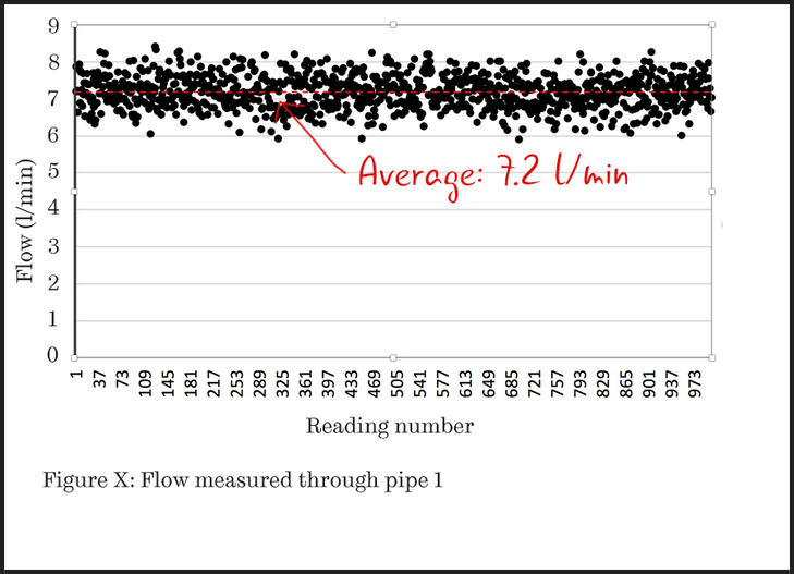
Figure 1: A scatter plot with 1000 data values.
Rank the data points
Simply by ordering the data points, the reader can more clearly see what the distribution of the readings is. If the data plots as a straight line, then the data is uniformly distributed throughout its range. However, this is unusual.
The plot of Figure 2 is more typical, with curved ends. You can imagine the horizontal axis being stretched until the line is straight. Once this is done, the amount of stretching indicates the statistical distribution that best describes the data, with associated parameters being given by the properties of the straight line.
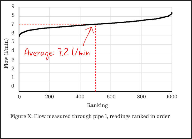
Figure 2: In this scatter plot, the data points have been ranked in order so that the distribution of the readings is clear.
Categorise the data into bins
You could also display the distribution as a histogram. This requires that you analyse the data, counting how many results fall into separate “bins”. In this example, these are the ranges of flow rates shown on the horizontal axis.
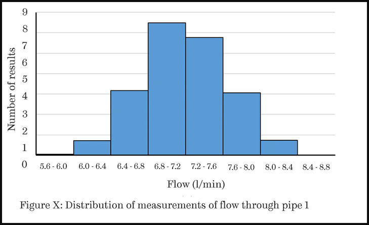
Figure 3: In this histogram, the data has been categorised into ‘bins’.
Using a histogram is appropriate if you have chosen a few bins (notice that with only eight bins the labels on the horizontal axis are already quite difficult to read). It is usual to widen the bars of a bar chart being used as a histogram, as shown in Figure 3, to indicate that there are no empty bins between those shown.
Use a line chart
If you wanted to show more details of the distribution, you could use a line chart. Here each point is at the centre of the bin and the continuous line indicates the implied distribution of measurements.
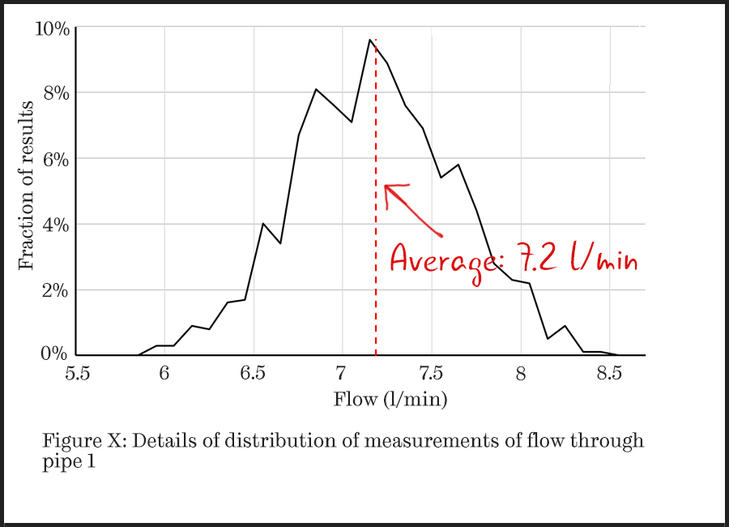
Figure 4: In this line chart, each point is at the centre of the bin.
In summary…
If you want to illustrate a distribution of results:
- use a bar chart (histogram) if you have a small number of histogram bins
- use a scatter plot to show a cumulative distribution or to plot a histogram with a large number of bins