
Types of graph (and when to use them)
You have results from your experiment and want to present them so that the reader understands what you have found. It is said that a picture is worth a thousand words, so it’s worth taking some time to get the correct information well presented.
There are three main types of graph that you could use in your report:
- Bar chart
- Pie chart
- Scatter plot
The type of graph you use will depend on your data and on what you want your reader to notice.
Let’s look at an example.
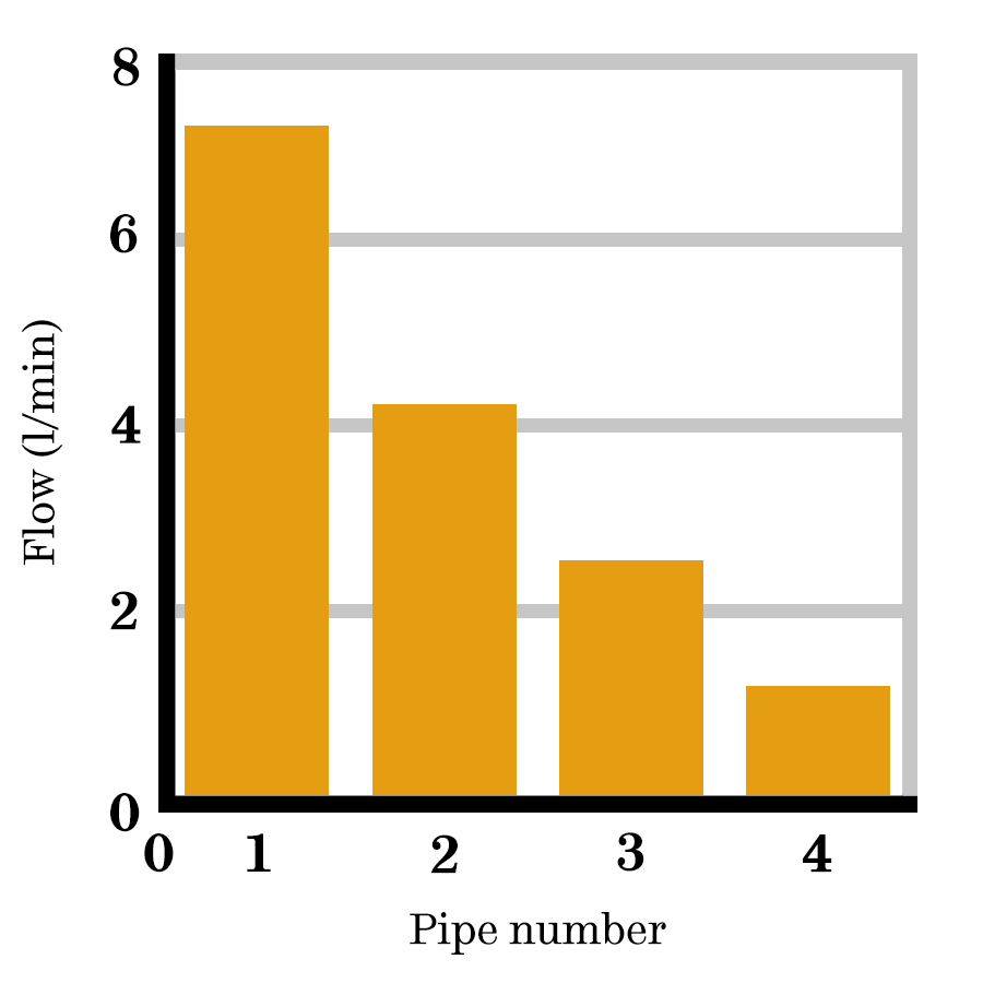
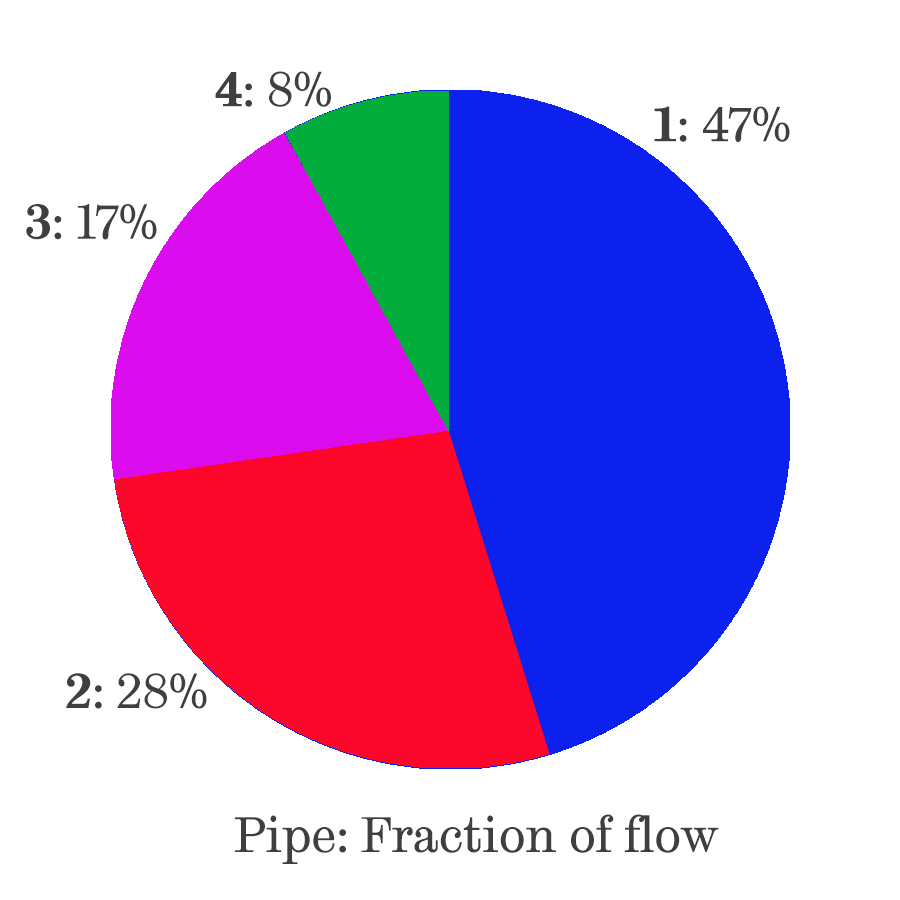
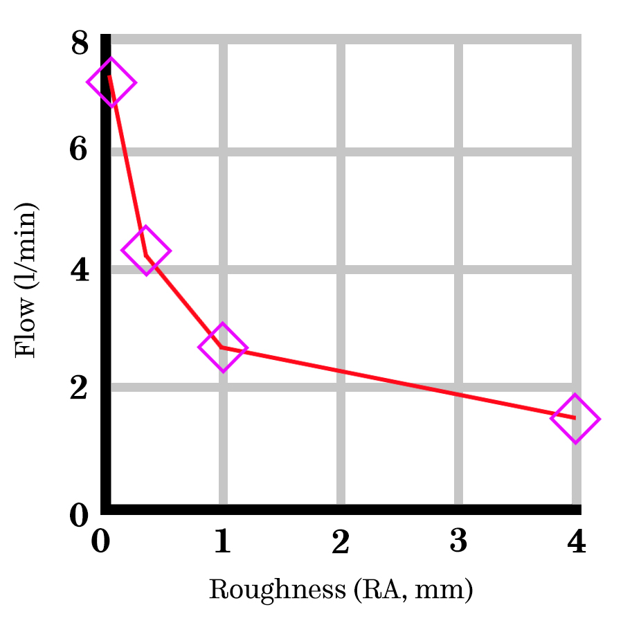
Imagine you are measuring average flow through four pipes of different roughness.
| Pipe number | Roughness (RA)/mm | Flow (l/min) |
|---|---|---|
| 1 | 0.02 | 7.2 |
| 2 | 0.25 | 4.3 |
| 3 | 1.0 | 2.7 |
| 4 | 3 | 1.3 |
Table 1: Average flow measured through four pipes of different roughness.
If the experiment was to compare the flow through the pipes, then a bar chart would be appropriate. Bar charts are used to compare results for a set of different conditions. They can be horizontal too which is useful if labels are too long or there are more than about 6 data points.
If the experiment was to determine the proportion of flow through four pipes connected in parallel between a high and a low pressure reservoir, then a pie chart would be appropriate. Pie charts are used to explain how a total is broken down and are particularly good for illustrating fractions. They are rarely used in technical reports of laboratory or experimental work as there is no simple way to use a pie chart to illustrate multiple readings.
If the experiment was to explore relationships between pipe roughness and flow rate, then a scatter (line) plot would be appropriate. Scatter plots are used to show the relationship between two variables or the development of a variable over time. This is the most common type of plot for laboratory or experimental work.
If the experiment was to determine which pipe had the largest flow then it may not be appropriate to include any graph. You could include the table, perhaps highlighting pipe 1. Tables are ways of displaying data where the actual numbers are important. We’ll come back to tables later this week.
Let’s look at some different data scenarios and the types of graphs you could choose to present this information.
Comparing results
You have carried out an experiment for a set of different conditions and want to compare the results. Each condition can be represented by a column in a bar chart. However, if you have more than one result for each condition, a bar alone would not be sufficient to indicate the range of results.
Instead, you can use “error bars” - these look like capital I’s, showing the spread of your results for the condition. These do not indicate errors, but rather the overall distribution of the data. This could be the range, the standard deviation or for example, the 95% confidence level. You would describe what they referred to in the text.
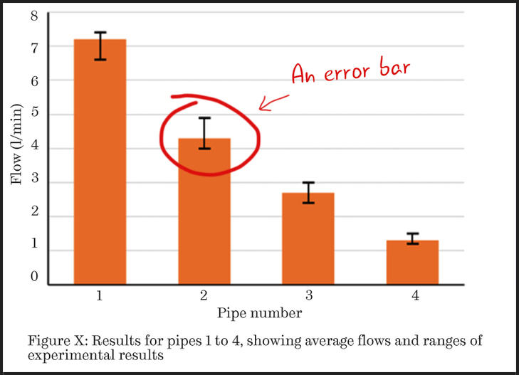 Figure 1: This bar chart features error bars to demonstrate the range of results obtained.
Showing relationships between results
If you want to show the relationship between variables and have multiple results, then you could plot all of the results on a scatter graph and include a trend-line to illustrate the observed trend.
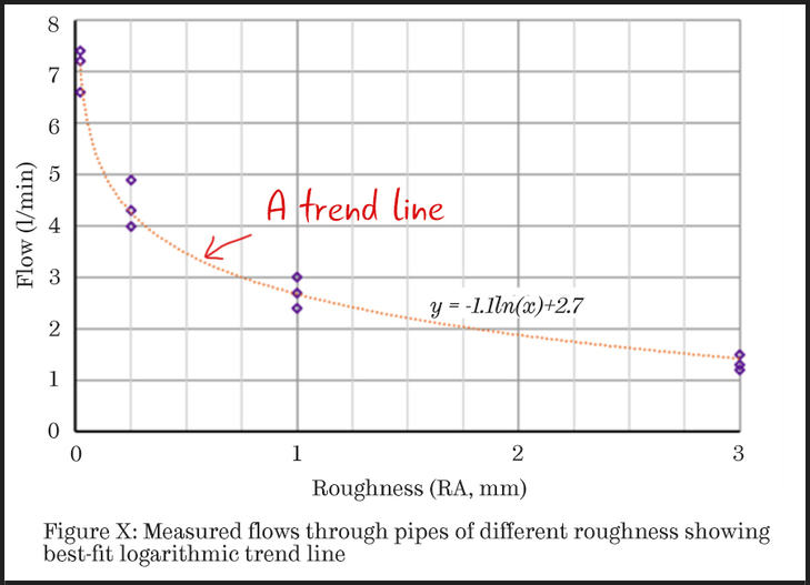 Figure 2: This scatter chart features a trend-line to illustrate the observed trend.
Figure 2 has the usual linear axes, but if you wanted to emphasise a non-linear trend it may be better to use a logarithmic scale on one or both axes.
On a base 10 logarithmic scale, each value on the x-axis is the previous value multiplied by some number. For example, in Figure 3 below, the values on the horizontal axis are 0.01, then 0.1, 1 and finally 10.
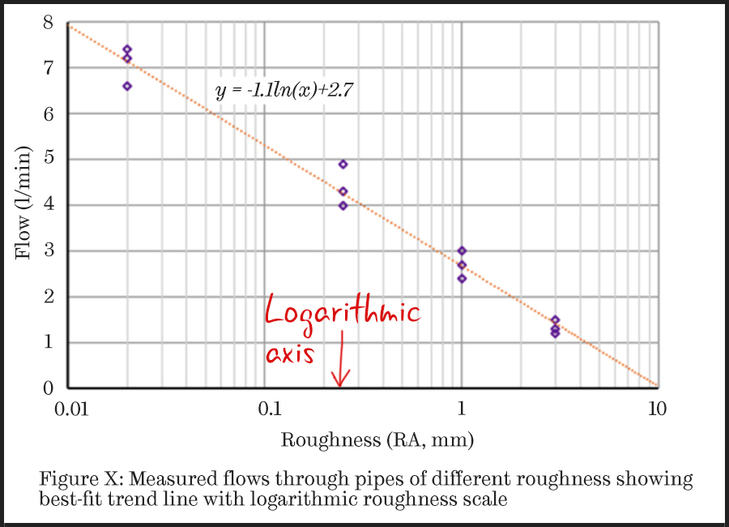
Figure 3: This scatter chart demonstrates that the data is consistent with the ‘expected’ type of equation (presented as the equation of the trend-line).
Logarithmic scales are harder for your readers to interpret than linear ones so you need to have a good reason for changing the scale. You will usually use them if you want to demonstrate how well your data fits a theoretical nonlinear equation.
For example, in Figure 3, the equation of the trendline is y = -1.1ln(x) + 2.7, in which ln(x) indicates the natural logarithm of x.
By using a logarithmic scale, the reader is able to see how well the data agrees with this equation. This could support later discussions in the report about the level of roughness at which flow would become negligible.
In summary…
If you want to illustrate a:
- comparison between cases, use a bar chart.
- relationship between variables, use a scatter plot.
- division of a total into different components, use a pie chart.
If you have multiple values for a set of experimental conditions (more than about 10) then you may wish your reader to understand how they are distributed. Showing a distribution of results is only necessary if you have many results for a set of experimental conditions.
We’ll look at distributions in more detail on the next step.
Discussion
Consider the experiment reported in Figure 2 (above). How would you present the flow measurements if you measured the pipe roughness and found it was different at different positions through the pipes?